Akiva Elkin Email me

How I decide what to build

Real changes from my apps. Each one began with a problem a real person hit, usually me, and ended with the version you can run today.

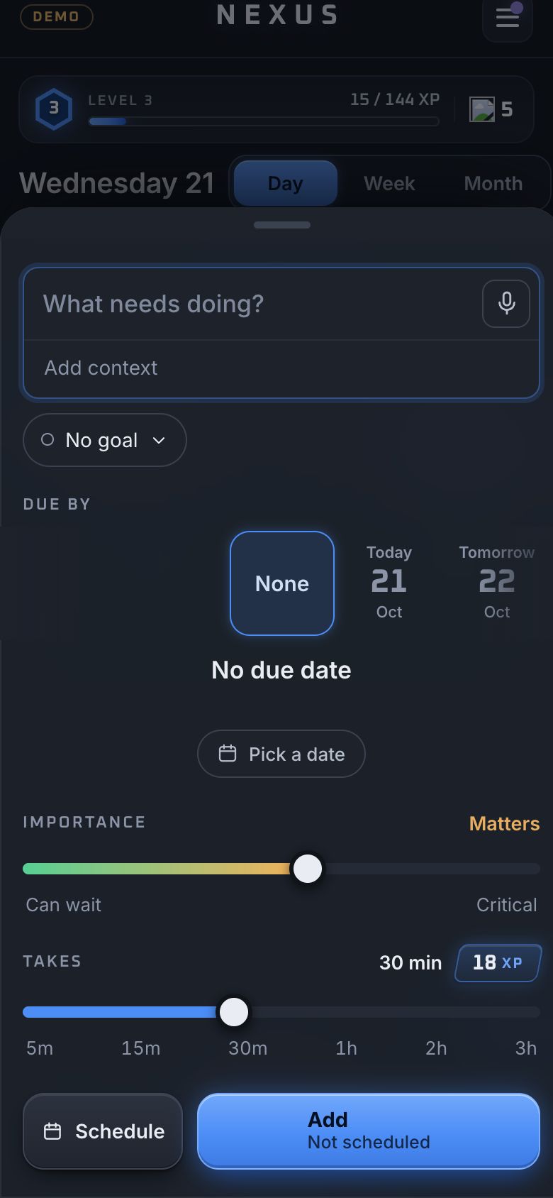
Due by as six chipsDue by as a sideways dialDue by as two wheels

Due by, three times in a week

Nexus, 6 to 13 Oct 2026. Every mission has a due date, and setting one took too many taps and too much of the screen.

Six chips

Today, Tomorrow, This week, Next week, This month, Next month, and Pick a day. Quick to read, but they wrapped onto two rows and a date that was not a chip meant opening a calendar.

A sideways dial

One row you scroll, with the choice in a blue box and the date written underneath. It held every option, but it was big, and you had to look at it to land it.

Two wheels

Day on the left, time on the right, about half the room the dial took. Anything off the wheels opens a month or a clock in place and then joins the wheel with a blue dot.

What I chose. Two wheels. They work by thumb without looking, they set the time as well as the day, and the rare date stays one tap away instead of crowding the common ones.

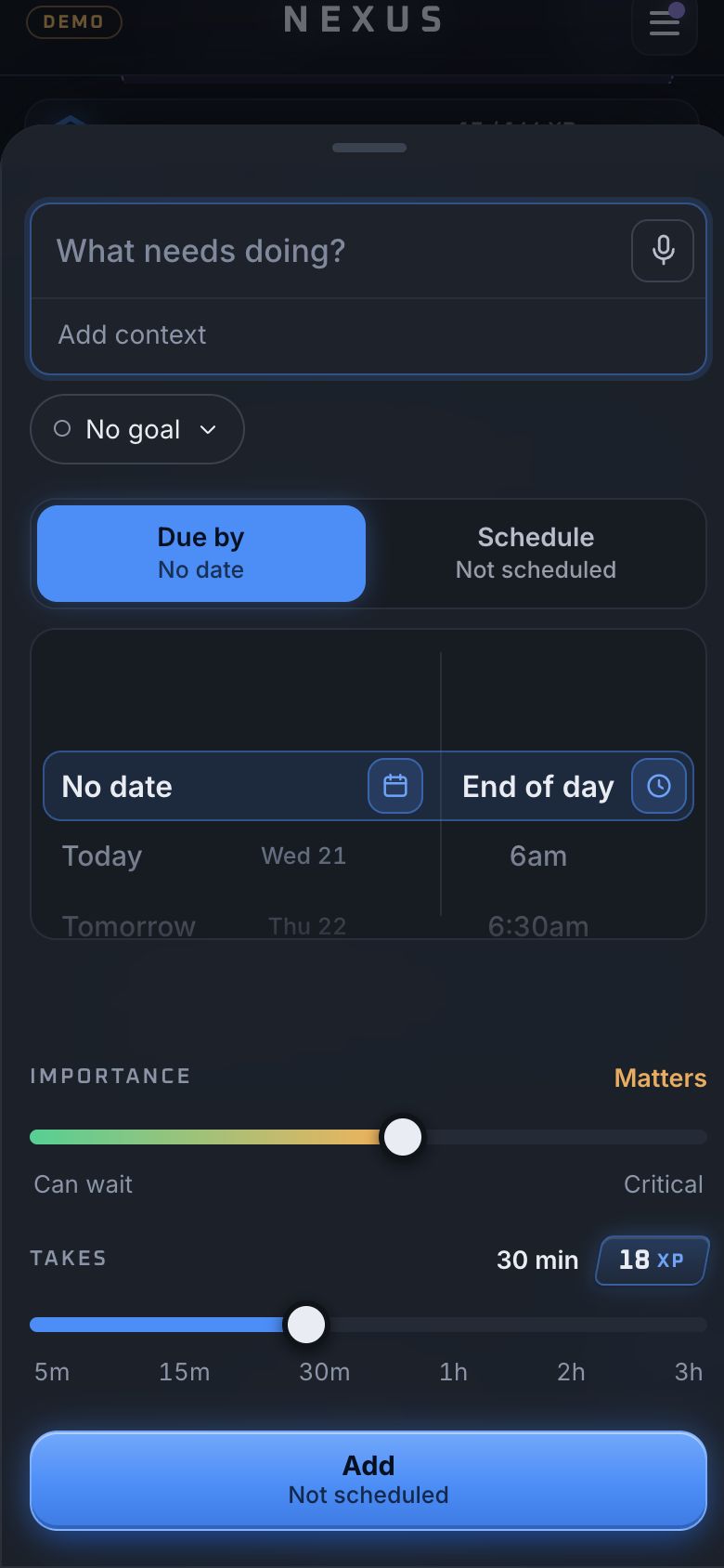
One picker for two dates

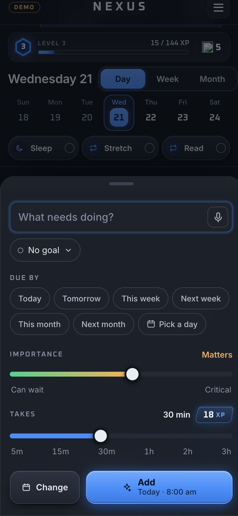
Nexus, 17 to 21 Oct 2026. A mission has two dates, when it is due and when you plan to do it, and Nexus set them in two different places that looked nothing alike. Picking a time felt clunky.

What changed. After three options in the first round and six in the second, I asked for something none of them tried: Due by and Schedule merged into one picker, with a switch on top for which date it sets. Four more rounds took it down to the last detail. It is the picker in Nexus today.

Why. Twenty-one options over six rounds sounds like a lot for one control, but it sits on every mission. Every round took something away: arrows, a week line, a countdown that repeated what the colours already said.
Nexus · New mission

Blue felt too relaxed

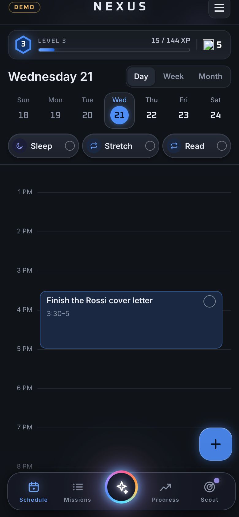
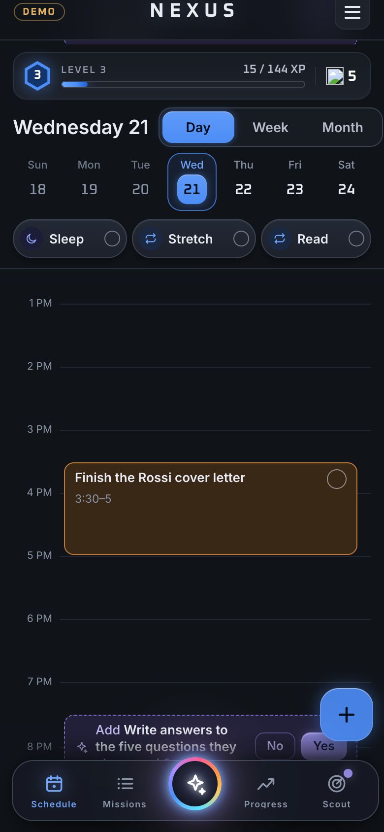
Nexus, 6 Oct 2026. Planned missions on the Schedule were blue, the same calm colour as everything else, so a full day of work read as a quiet one.

What changed. A light orange tint for anything still to do, and green the moment it is ticked.

Why. Colour on a schedule should answer one question at a glance: what is left. Later, the edge of each mission took on its deadline: red at three days or less, orange at a week, yellow beyond.

After: orange, then green
Before: blue
Before: blueAfter: orange, then green

Save should only save

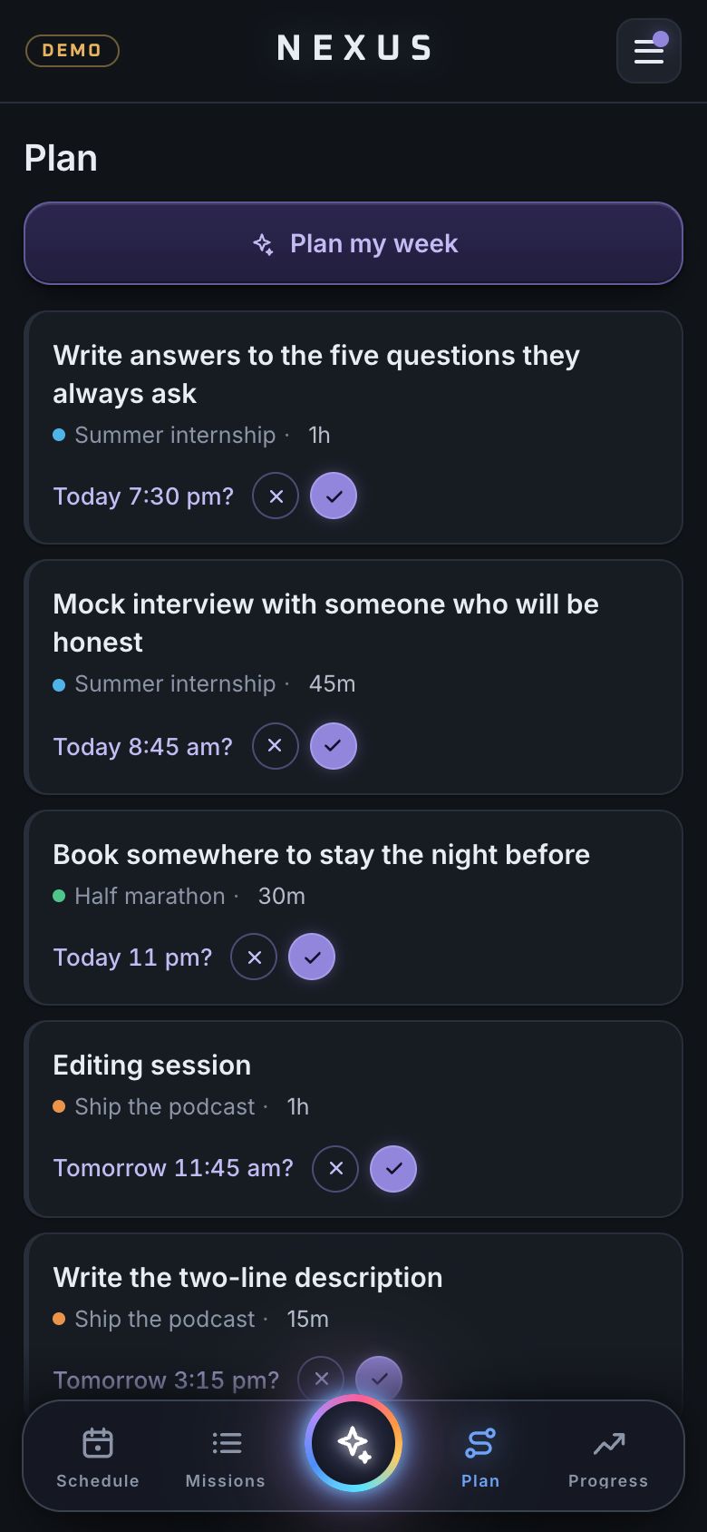
Nexus, 11 Oct 2026. Editing a mission and tapping Save could quietly drop it into a time Nexi had suggested, if you had touched a slider. You meant to fix a typo and found it on your calendar.

What changed. Save keeps an unscheduled mission unscheduled. The left button says Schedule when it is off the calendar and Reschedule only when it is on it.

Why. An assistant that acts without asking loses trust faster than one that does too little. Nexi still proposes times; it never places one on its own.

Nexus · Plan

Never tell eight people they are last

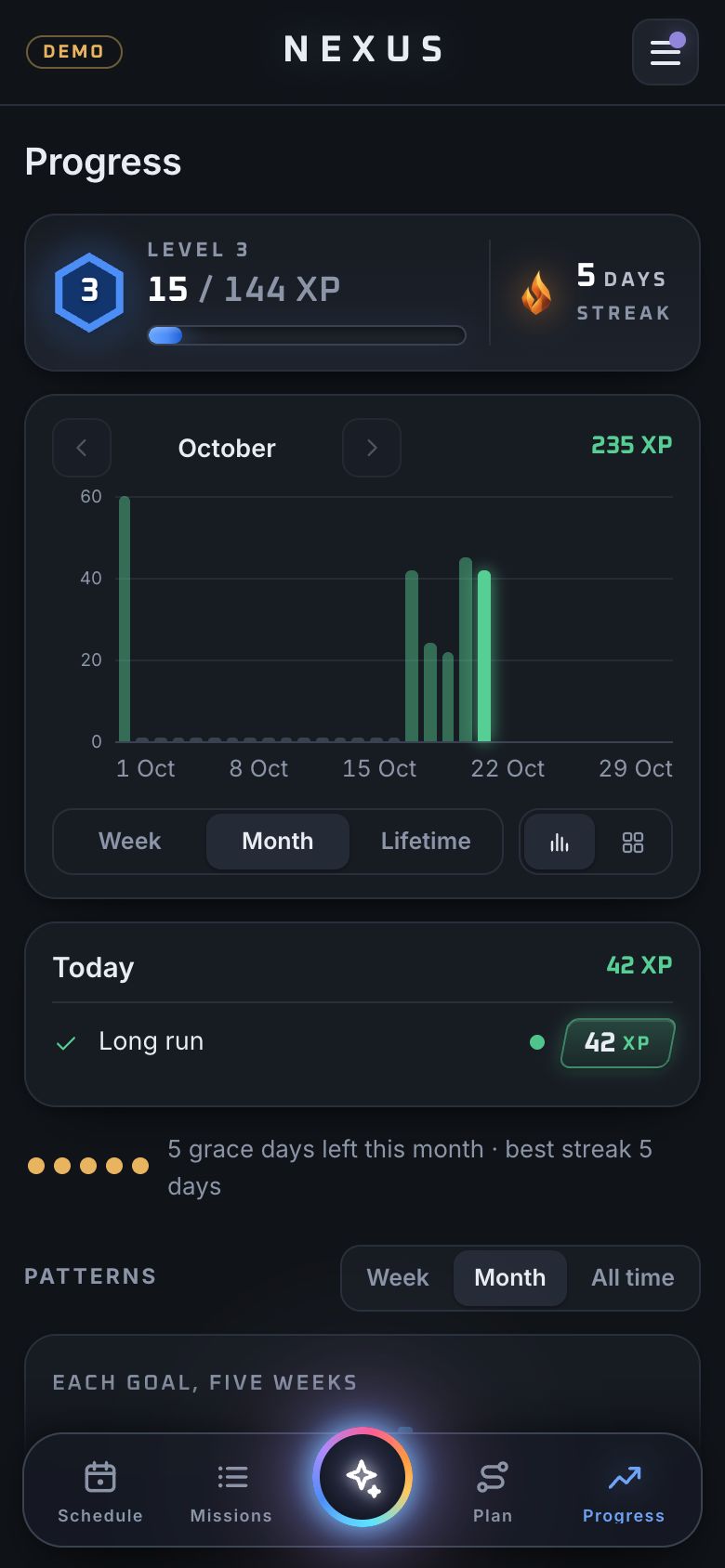
Nexus, 18 Sep 2026. Nexus had eleven accounts and a new leaderboard. Eight of the eleven had never finished a mission, so on day one the board would have opened by ranking most of my friends at the bottom.

What changed. An account joins the board the first time it finishes a mission. The Sunday notification names only the gap to the person either side of you, never the full list and never how much you left undone.

Why. A leaderboard is there to pull people in. Shown cold, it pushes away exactly the people it is for.

Nexus · Progress

The demo stays in its tab

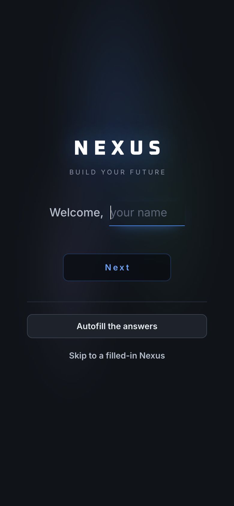
Nexus, 24 Sep 2026. I showed someone the demo on my own phone, and the next time I opened Nexus my real account had turned into the invented one.

What changed. The demo now lives in the one tab it was opened in, and leaving or resetting it clears everything the last visitor typed.

Why. Being shown a product should never change the product for its owner. It is also why the demo on this site cannot touch anyone’s real data.

Nexus · Setup

Pace, not percent

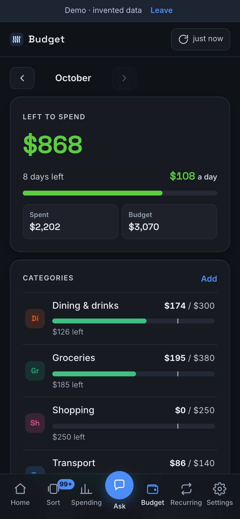
Tally, 16 Oct 2026. A budget bar that turns red at 80% spent is wrong twice: 80% gone with two days left is fine, and half gone by the 5th is not.

What changed. Bars and the big number slide from green through yellow to red by how much you have spent against how much of the month has passed. Rent and bills are left out of the maths, because they land in one go.

Why. Paying rent on the 1st should not turn the whole month red. The colour now tells you whether to slow down, which is the only thing you open a budget to find out.

Tally · Budget

Learn from decisions, not from timers

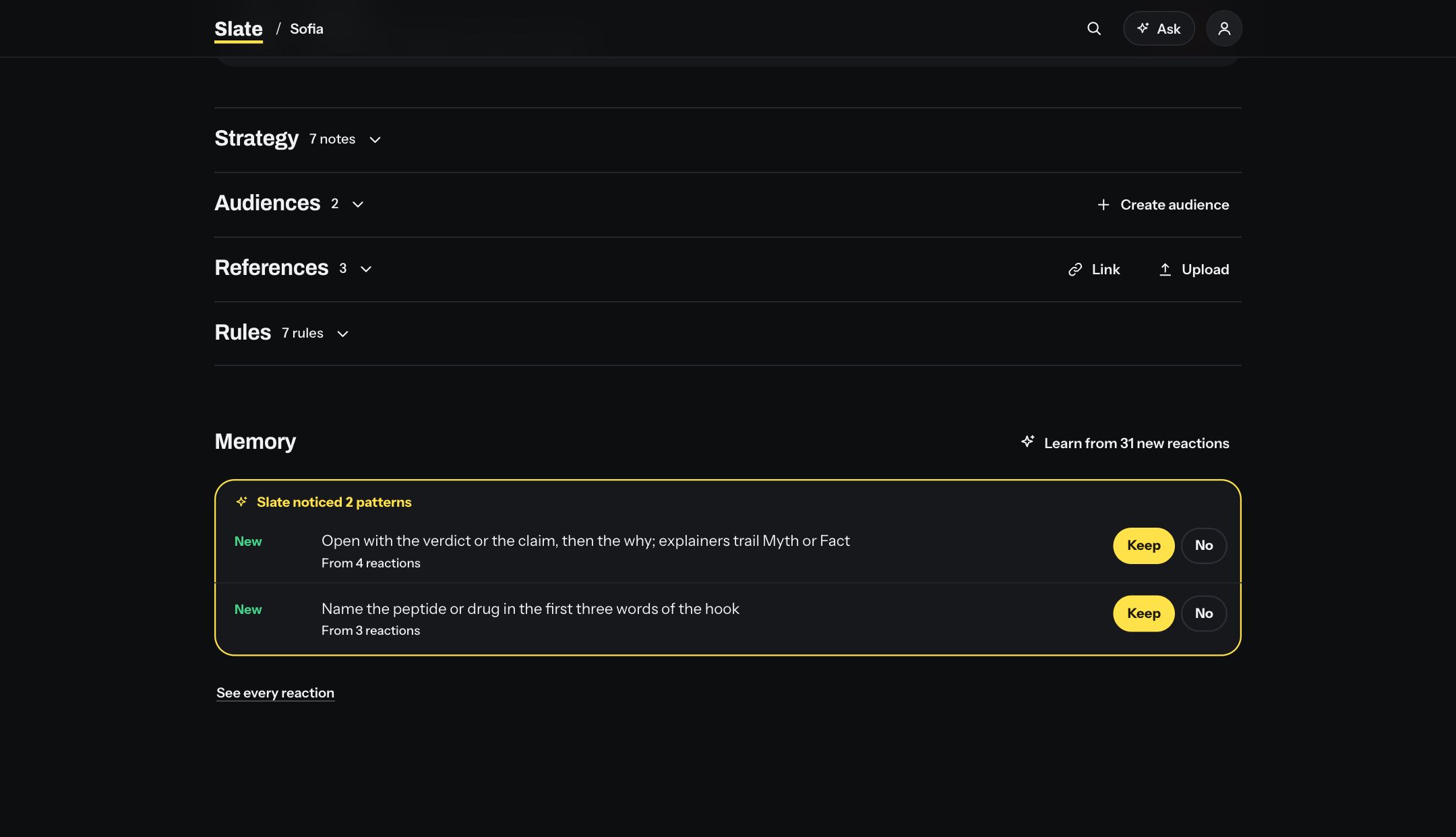
Slate, 14 Oct 2026. Slate’s memory rewrote what it knew about a client on a timer, so it learned from half-finished reviews and from ideas nobody had judged yet.

What changed. It learns when a decision is made: the Learn button, sharing a topic list, finishing a studio session, or marking a session recorded.

Why. What a team approves and rejects is the signal. Anything else is noise that makes the next session’s ideas worse.

Slate · client2

Run them yourself